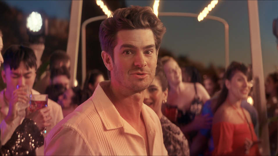

The Look colourist, Grace Weston, took over the sole responsibility for the grade on the final season of Eleven Film’s Netflix drama, Sex Education. Here she explains how she drove the look of the series in to new locations
Taking on a project in its fourth series raises the challenge of how you can continue to develop something new and exciting within a very recognisable space. Having been involved in the last three series of Sex Education from Assistant Colourist to Junior Colourist to Colourist, and with a new creative team attached there was a space here for us to evolve the show even further.
Director Dominic Leclerc and DoP Andy McDonnell were big fans of the look from season three, and this is something we wanted to ensure was felt throughout the new series. Working with the environments we had seen before felt very natural. Andy wanted to keep places like Jean’s house and the kids rooms in the same space as we had seen before, and that is evident in the way they are lit.
The new colleges gave us a great opportunity to develop the look of the show further. Dom wanted to create a real contrast in these spaces. We took the ‘timeless Americana’ brief from the previous seasons and pushed it one step further. Cavendish was described as a ‘Vintage vision of the future’. We wanted the sunny positive vibe to erupt from the screen here. We were often warming this space to help with this feeling, using a mixture of curves to enhance the warmth of the highlights and push the sunny stylistic feel to the space.
Concrete walls and lots of open spaces meant a lot less colour than found in the Moordale set in previous seasons. There was a fine line here that we were riding between forcing colour into the space and allowing it to sit in a slightly more neutral way. Adding warmth into the highlights helped with this, alongside tweaking the blues in the shadows to push the film emulation feel. We managed the bright costumes and set pieces by shifting the hue of the colours and desaturating the most saturated parts which made the space feel more cohesive. The Cavendish look was much more akin to the Moordale look from the previous seasons but given that the bright rainbow of colours were so crucial to the story, we allowed them to sing .
Maeve’s American college was a space that I was very excited to work with. As a teenager growing up on a steady diet of Gilmore Girls and Gossip Girl, I was drawn to the richness of the set and the east coast academia style to the production design. On our first day grading I approached Andy with this in mind, and thankfully he was very happy to follow my lead! To do this, we referenced the Moordale auditorium from the previous series, but skewed the shadows towards purple and muted bright colours that diverted us away from our palette, such as bright blues and greens. I wanted the skintones to feel creamy and youthful and balancing out the amount of red in the scenes was important to this. We occasionally added a tiny amount of grain to add even more texture into the space.
My favourite set to work with was the crematorium. The warm wood walls and blue/green design landed really beautifully together. Alyssa McClelland, our third block director wanted this scene to feel rich and textured. This was done by using our proprietary Technicolour look combined with a series of colour curves to narrow the palette, alongside some shaping to really direct the light in the space. The scene had been shot over 5 days, on location in different weather conditions. Andy had done a beautiful job managing the changing light but adding shape to the image became vital to making this scene shine.
One of the larger challenges of this series was managing a shoot that ranged from mid-summer to the dead of winter. Sex Education is known for its all-American blue skies and for the later blocks shooting through November to February there was every type of weather going. I tackled this through a series of sky replacements alongside popping highlights to balance out the lighting changes. This was combined with VFX to ease the transition of fog and mist and add greenery in where leaves had started to change. By the end of the season we had started to lean into the weather, especially in episode six, where tonally the rain worked incredibly well.
I’m really happy with the look of this series. It’s developed beautifully in its fourth and final outing, and feels like a fitting end to a beloved show. Whilst modern post production always comes with timing challenges, collaborating with all of the creatives on the show has been a very rewarding experience and as ever has come away looking wonderful.


Jon Creamer
Share this story