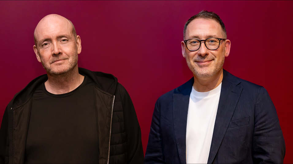
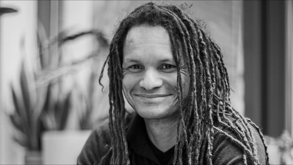
Paul Harrison, Colourist and Co-Founder at Residence Pictures, on the responsibility for colourists to accurately, and beautifully, represent the variety of skin tones throughout any cast.
Colour Grading for Diverse Casts and Global Settings
The conversation around colour grading in Film & TV has historically revolved around look, style, and polish. Today, that conversation is evolving and rightly so. As the industry tells more stories from a variety of underrepresented voices, with casts that reflect the full spectrum of global audiences, colour grading has become as much about representation and authenticity as it is about aesthetics.
The challenge behind the craft
Working with diverse ensembles is a creative privilege that comes with a degree of technical responsibility. Every skin tone has nuance – subtle variations in undertones, texture, and ways in which light interacts with it. But the tools we use, and the workflows we inherit aren’t always designed with diversity in mind. Certain grading systems can carry embedded biases: default colour spaces or LUTs that flatter lighter complexions while flattening or distorting darker tones.
It’s critical our infrastructure keeps pace so that colourists aren’t left to self-teach when it comes to working with diverse skin tones. Technology has a huge role to play and extends to the tools that even DPs are using – whether that’s through the cameras, monitors, or the reference imagery – it all needs to be able to reflect the breadth of the human complexion.
As colourists, it’s our job to spot these limitations and correct them. I spend a lot of time ensuring there is fairness across the frame and that the talent onscreen is represented authentically. It’s about recognising that every shade of skin tells its own story, and that audiences notice when those stories are mishandled.
Shaping global perspectives
Grading doesn’t just shape how people look but also how places and locale feel onscreen. That’s something audiences pick up on instinctively, even if they don’t realise it.
Let’s take The White Lotus as an example. Each series looks different: Sicily feels sun-drenched, while the tropical landscapes of Hawaii and Thailand felt lush and heightened. Whether you agree with those creative decisions or not, the principle is clear: grading choices can anchor us in place just as powerfully as costume or production design choices do.
On any project I work on, I try to ask early on – what does this story’s world look like, and how does it feel?
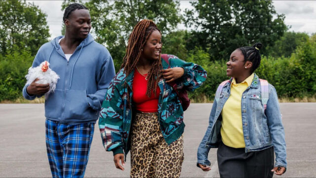
For Dreamers, the goal was to ground the series’ visual and thematic identity in realism – capturing the grit and pulse of contemporary Leeds. We wanted the dancing sequences to feel profound and therefore applied subtle colour separation, heightened contrasts, and a touch more saturation to lift the rhythm. It was about using the reflectivity of light to capture the physicality and sweat from each member of the ensemble cast, making those moments feel as kinetic as possible yet emotive.
Collaboration from the onset
As colourists, we work hand-in-hand with directors and DPs to shape how a story feels and how its characters are perceived.
The earlier that collaboration starts, the better. I’ll often sit with the DP to talk through reference images, test different LUTs, or even experiment with how the camera responds to different skin tones. Those conversations set expectations, avoid surprises later, and allow us to build a consistent language from set through to grade.
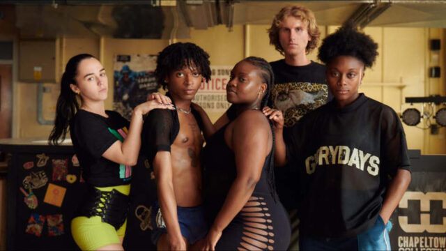
On Just Act Normal, the brief was to keep everything rooted in naturalism. That meant maintaining a consistent palette even in uncontrolled, documentary-style conditions. It was shot entirely on location in a real primary school – the bright colours and natural lighting gave us an amazing set to work with.
The DP and I carried out extensive tests to ensure we represented the cast’s complexions correctly under different lighting scenarios as the production was both sensitive and committed to correctly portraying the actors. With the Alexa 35 as our camera of choice due to its huge dynamic range, we were able to make the most of that natural light. Working on Baselight, I created a look that had great colour separation and gave a richness to the shadows and actors’ skin tones.
The key lesson? Colourists and DPs should see each other as creative partners, not as separate steps in the production pipeline. Early dialogue, shared references, and open experimentation create a smoother workflow and, ultimately, a stronger visual result.
The responsibility of colour
We’re at a turning point. Audiences are more attuned than ever to issues surrounding representation, and they expect stories to reflect the world around them truthfully. Colour grading is a subtle but powerful part of that expectation.
Handled carelessly, it can undermine a story. Handled well, it deepens authenticity, strengthens emotional connection, and ensures every performer and every place feels seen.
Colour plays a role in embodying people, their identities, and their stories. And as colourists, we have both the responsibility and the privilege of making sure those stories are told fairly, authentically, and beautifully.


Jon Creamer
Share this story